|
|
|
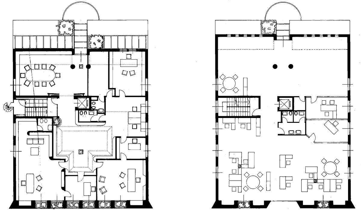
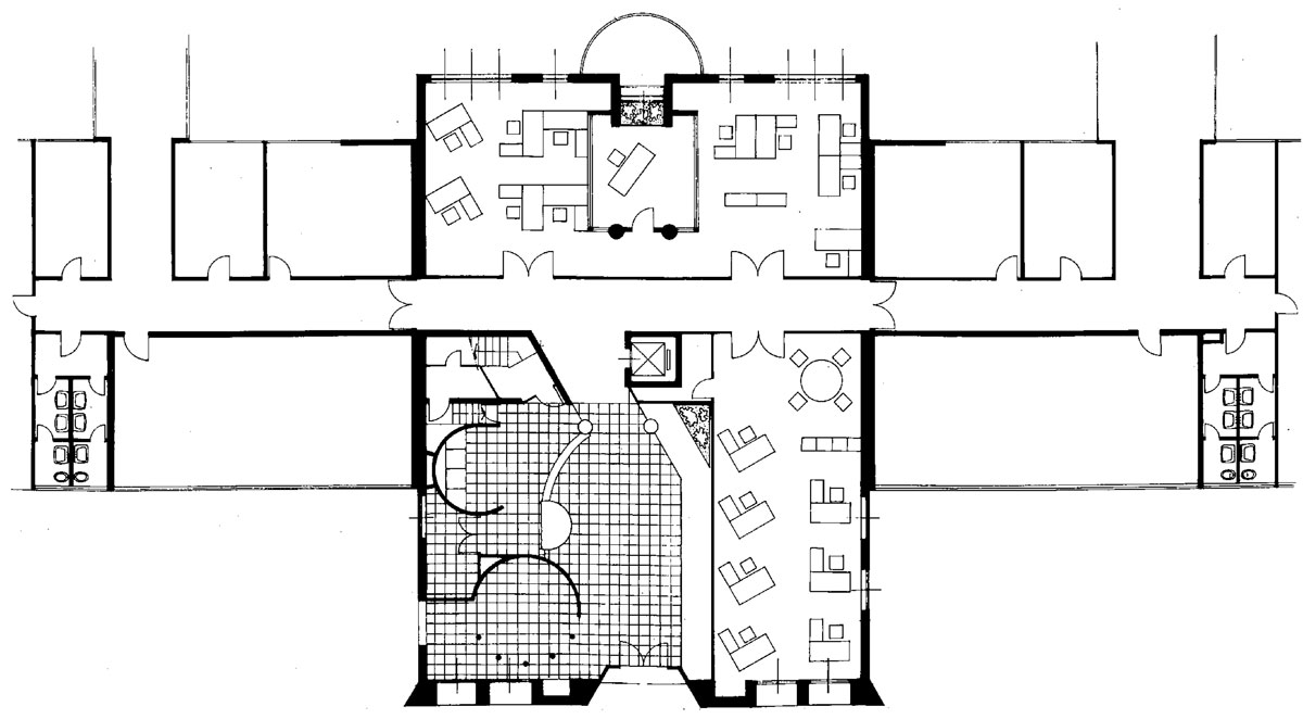
| The
subject here was quite simple: there was a need to increase the office work
unit's surface to create new working areas. We could have completed an already
existing one floor "comb" scheme or defining a three storeys building
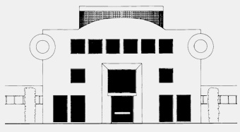
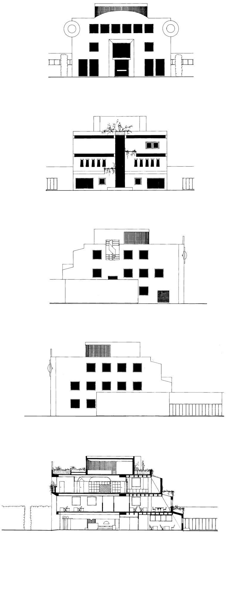
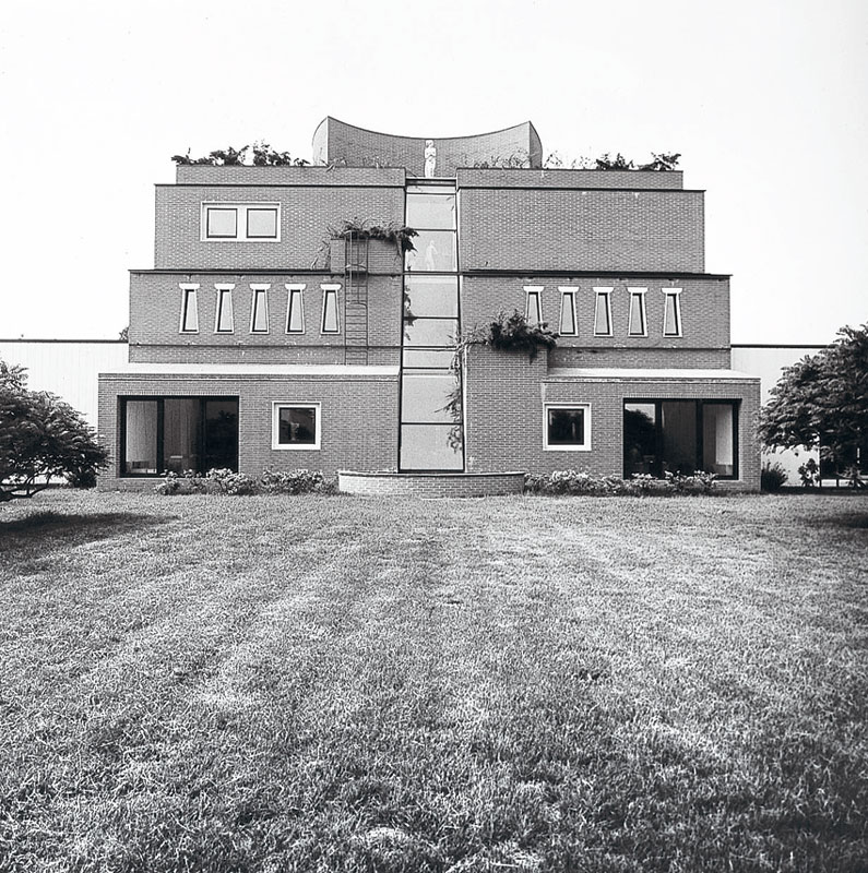
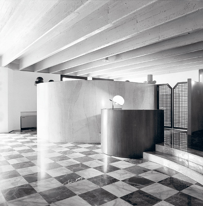
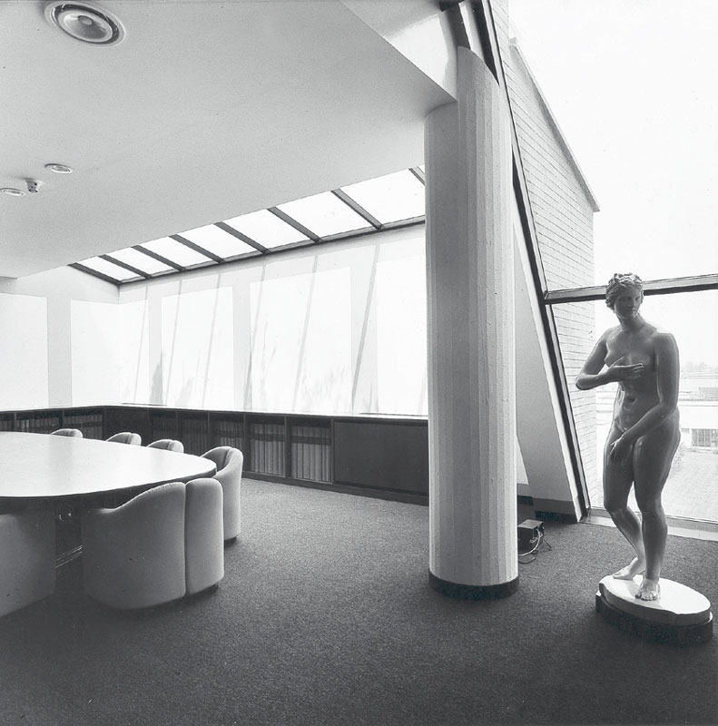
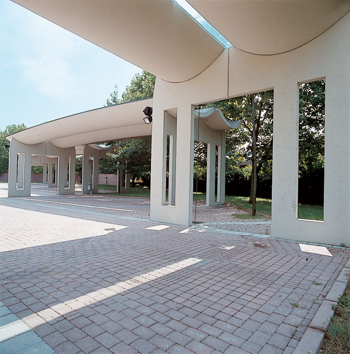
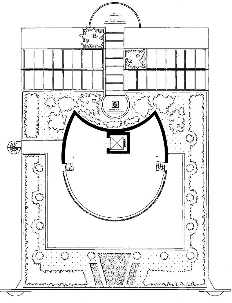
in the backyards, between the two existing units. We decided to realize the second solution. The architectural sign could always relate to the existing lots- automatically without any sympathy- or being totally detached in an uncommon way, allowing us to develop our cherished subject: the building as a place for architectures. This explains the double meaning of the architectural sign, with one internal front towards the courtyard and one external front towards the garden. Two architectures with opposite signs "happen" to be in this building. A ambiguous and romantic sign towards the garden; a provocative and advertising-type of sign on the facade, adeguate to an editorial house. In fact, this is an architecture advertising itself towards outside, while the inside is made to give a desired security and reassuring protection for the employees. In 1982, there was a need to trasform the external part of the existing one floored building , made of white laminates. We changed it with a better lasting material. Valentina and myself decided to design a tricky thing, transforming the internal garden into a scenery, full of caryatids who were supposed to hold a virtual architrave. On the entrance front, there are three seated figures who are welcoming visitors. G.M.O. |
|
   |
|
   |
|
   |
|
|
|
![]()